What is really known about human response to colour, particularly in a healthcare setting? Are colour design guidelines for healthcare environments supported by scientific research findings? It appears the answers, according to Ruth Tofle and her team, are: very little and hardly any.
In 2004 the Coalition for Health Environments Research (CHER) commissioned a definitive review of existing research into the use of colour in healthcare environments.1A full copy of the report can be downloaded from here.
According to the authors, the purpose of the review was to separate “common myths and realities” in the applications of colour in healthcare design. In the process they have clearly shown that much of the knowledge about the implications of colour in healthcare environments is based on “highly biased observations, and pseudo-scientific assertions. It is this inconsistent literature that has been spun to capriciously colour trends in the healthcare market.”
The scope of the review is extraordinary, spanning the disciplines of art, architecture, the physical sciences, behavioural sciences, and the combination of these fields.
The primary findings of the literature review are:
- There is not sufficient evidence to support direct linkages between particular colours and health outcomes of people.
- While the reviewed studies argue for the existence of colour-mood association, there is no reliable evidence to suggest a direct relationship between a given colour and a given emotion. 2
- There is some evidence to suggest that colour applications can affect the perceptual experience and performance of people in particular environments, for example, our sense of spaciousness can be affected by contrasting colours.3
- The popular press and the design community have promoted the oversimplification of the psychological responses to colour. Many authors of guidelines tend to make sweeping statements that are supported by myths or personal beliefs.
- Most colour guidelines for healthcare design are nothing more than affective value judgments whose direct applicability to the architecture and interior design of healthcare settings seems oddly inconclusive and nonspecific.
- The attempt to formulate universal guidelines for appropriate colours in healthcare settings is “ill advised”. 4
What does it all mean?
In the wake of this review, as designers, we are left with a common evidence-based problem: how to work with unreliable evidence when we have to make design decisions, often with clients insisting on a performance-based outcome. On the plus side, this review goes a long way towards shattering some harmful myths that have become part of accepted disciplinary knowledge. At the very least, we now have the ability to advise our clients more clearly on what colour can and cannot do.
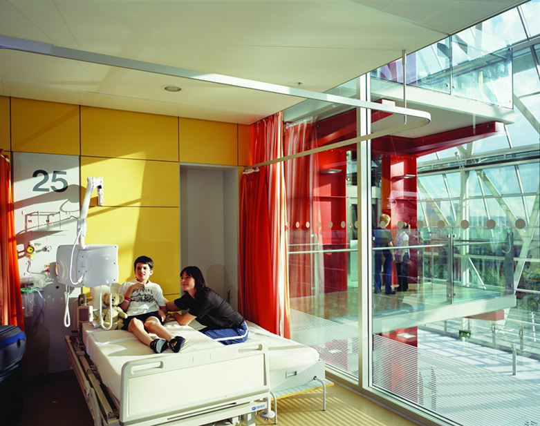
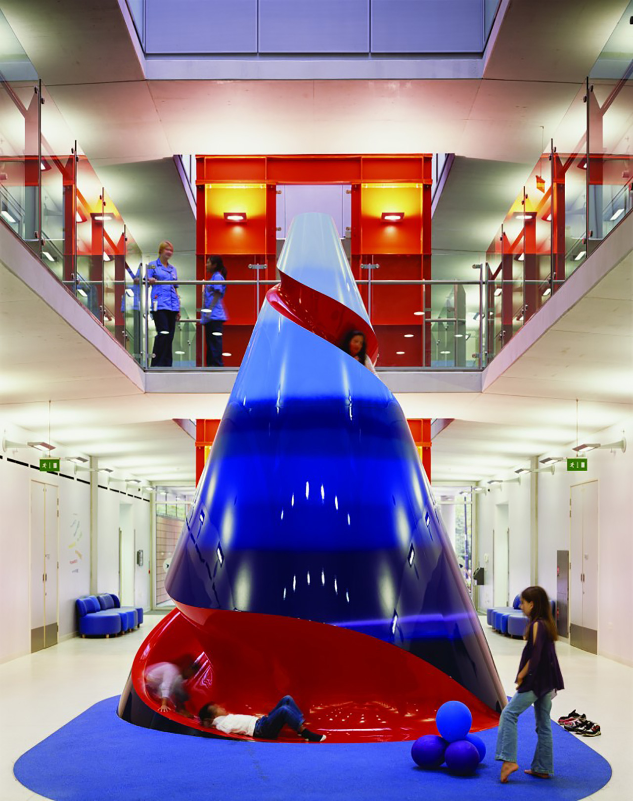
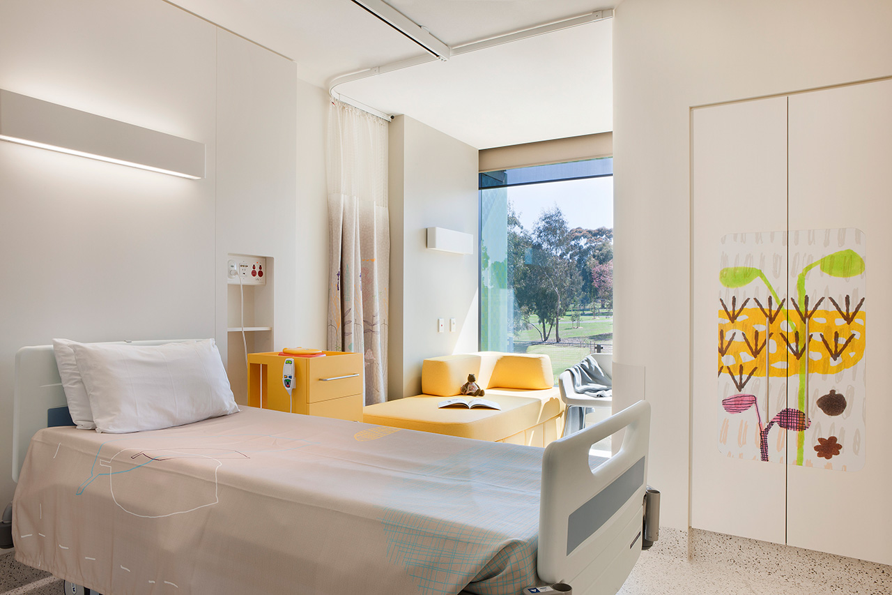
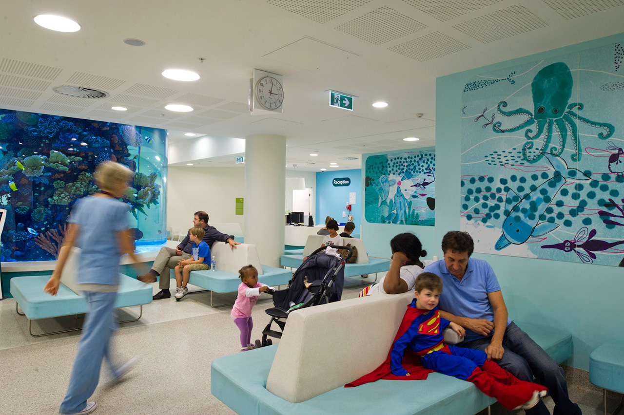
Although, currently, there appears to be no reliable evidence to help us understand the emotional impact of colour, there is some useable knowledge about how colour can affect our perception of spatial qualities and those concepts can be explored through design. Clearly, greater care should be taken to avoid attributing affective properties to the use of colour in any environment. However, as can be seen from the images of Hopkins Architect's ECH in London, and the RCH in Melbourne by Bates Smart and Billard Leece, colour can be effectively and creatively deployed in healthcare environments, particularly in children's hospitals. Our primary concerns should be limited to any assertions of predictable, performative value.
According to Ron Billard, director of the Billard Leece Partnership, the colour strategy was simply to create "a coherent, varied, integrated and child friendly environment, while assisting people with wayfinding through the hospital." The colour schemes directly referenced the natural Victorian environment and were intended simply as a distraction for children who are ill or undergoing difficult procedures. The degree to which the colour scheme plays a role in this distraction would be a worthy research project in itself.
When all is said and done, research about the use of colour in healthcare environment remains important and should be continued, although the subject matter is complex and multi-layered. Given the new digital tools available to us, it is inevitable that patterns of shared response will emerge in time, but more reliable research methods are needed and local variations must be accounted for. For this to occur, designers must become actively involved in this research effort because the application of research findings in healthcare settings also requires new thinking about how evidence is used in the design process. Data becomes a basis for design speculation, to stimulate creativity and not to search for absolute answers, and the outcomes produce new research questions.
The purpose of EBD is to provide designers with strategies for using even the most limited research, so in subsequent articles we will evaluate new research that has emerged (with mixed results) since the CHER review. In discussion with the authors, we will salvage what we can from over fifty years of theory in this contentious field.
Details
There is general agreement amongst the authors reviewed by Tofle et al that colour can elicit emotional response, define volumes, alter sense of time, affect thermal comfort, perception of weight, size, etc. The problem is that there is no reliable evidence to support these assertions, nor is there agreement amongst the authors on how these effects are achieved.
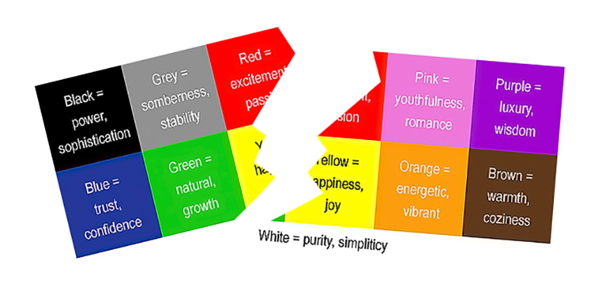
The literature contains significant contradictions about colour associations: some see yellow as mood enhancing, while others argue it is unsettling, or it is to be avoided because of an association with urine. Some authors assign emotional meanings to particular colours. Some authors claim that red has qualities of energy and passion; yellow supports optimism; green provides unconditional love; blue promotes loyalty; and violet has spirituality, although these outcomes are unsubstantiated in the literature. Some suggest that cool colours make time pass more quickly, others say that time is overestimated with cool colours. Some say highly saturated colors are more appropriate for elderly patients than pastels and strong colors are good where muscular effort or action are required. Others argue that intense colours may be too controversial and trigger unpleasant associations in the mind. The list goes on.
Examples of the typical assertions include:
“Carefully adjusting the brightness to softer colors of the same hues helps avoid monotony, and in addition keeps the eyes from being distracted, causing them to work overtime and produce fatigue.” 5
“Orange. Its nature symbol is the sun, defined often by its qualities of emotion, expression, and warmth. Orange is noted for its ability to encourage verbal expression of emotion.” 6
“The right colors can help to change moods from sad to happy, help dispel loneliness, encourage conver-sation, and create a sense of peace and well-being.” 7
According to Tofle et al, “these statements are nothing more than affective value judgments whose direct applicability to the architecture and interior design of healthcare settings seems oddly inconclusive and nonspecific…We naturally become suspicious when a color consultant prescribes a pink color for a patient room in order to influence her recovery from a surgery. The claim that the color of the room caused the recovery is an incomplete explanation…In our quest for understanding, we want to establish a causal account for the recovery.”
Colour Theory
A significant part of the problem, according to Tofle et al, lies with the nature of Color Theory, which they refer to as “an ambiguous term that … combines scientific explanations based on empirical studies with personal assumptions grounded in individual experiences and observations of human behaviors.”
The authors distinguish between positive (analytic, predictive) theories and normative (creative) theories, arguing that analytic theories are analogous to scientific theories. In other words, they are sets of general, abstract ideas through which we “understand and explain the material phenomena the world offers to our experience. They deal with how the world is, not how it might be. Normative theories, on the other hand, consist of statements on what ought to be.”
Tofle et al argue that because the design process is substantially creative, it requires normative theories similar to those that exist in art. However, they also argue that because the design process is also predictive, it needs “the analytic theories of actuality and possibility." Because Environmental design is based on "a cyclical process that involves creative as well as predictive phases…The normative aspects of a theory tell the designer where to search for possible solutions in the creative phases, whereas the analytic aspects inform the designer how the solution will work.”
The report concludes that, like other theories in environmental design, colour theories have too often been strongly normative and weakly analytic. They have been used (abused?) to create guidelines and prescriptions for action, but they are too weak in predicting what the settings will be like when completed and how its colours will influence the users.
The Way Forward
Since colours are experienced in the real world where “complex orders interact with the perception and behaviour of people”, Tofle et al argue that they need to be studied in a context in which “form, colour, texture, light and other contributing design attributes can be controlled and detected. Tests in isolated, sterile laboratories are perhaps helpful for initial colour studies, but they lead to impoverished perceptions of reality.”
The authors suggest that before we can specify colours, we need to recognize that humans react to colour on different levels. Some of these reactions are cognitive, others depend on perception, whereas other reactions are physiologically triggered. “The analysis of colour in any environment means respecting other kinds of processing forces such as culture, time, and location. But, while the detection of the psychological response to colour is imperative, the visual pathway from the eye to the brain is an important variable for the understanding of colour design.”
According to Ruth Tofle, the specification of colours should center first on the role of the colour in the environment and the intended activities in the space: “The performance specification should be the starting point for the designer who should be allowed to create colour combinations for the sake of the users that drew both on art as well as science.” The problem is that without reliable research, without a clearer understanding of what is possible and what us not, it is very difficult to produce performance specifications of any kind.
“If we want to have evidence-based guidelines, we need to understand what particular colours are supposed to do, and why, before we can proceed to implement them in a healthcare setting and before we can judge whether these colours do it well.”
-Tofle et al
This new understanding can only come through more sophisticated longitudinal research in cross referenced, real-world settings.
Conclusions
The primary conclusions that we take from this review are these:
- The use of colour in healthcare settings, currently is not based on reliable research.
- The attempt to formulate universal guidelines for appropriate colours in healthcare settings is, according to Tofle et al, “ineffectual”.
- We need to study systems, practices, and experiences outside of the laboratory, in their local context.
- We need to coordinate the methods that should be used to study and use colour in healthcare environments and these methods should be able to meet “the challenge of validity.”
Clearly, the research of colour in healthcare environment is important but, the subject matter is complex and multifaceted so our approach to research and design practice must change. Giving the last word to Tofle et al : “As designers, we need to discover what is important rather than assume that guidelines can cover every possible eventuality and provide solutions for all design challenges.”
-
Ruth Brent Tofle, Ph.D.; Benyamin Schwarz, Ph.D; So-Yeon Yoon, MA; Andrea Max-Royale, M.E.Des Color in Healthcare Environments – A Research Report (2004) produced for The Coalition for Health Environments Research (CHER) healthdesign.org/sites/default/files/color_in_hc_environ.pdf The report is freely available, however, CHER has now been amalgamated into the Centre for Health Design, who retain copyright. ↩
-
Despite contradictory evidence, consultants and designers continue to associate red tones, for example, with stimulating activities and blue tones with tranquility. According to Tofle et al, “The fact is that colours do not contain any inherent emotional triggers. Emotional responses to colours are caused by culturally learned associations and by the physiological and psychological makeup of people.” (Tofle et al, 2004) ↩
-
There are indications that certain colours may promote a sense of spaciousness or confinement, however, the effect is attributed to the brightness or darkness of colour and is highly influenced by contrast effects between objects and their background. (Tofle et al 2004) ↩
-
Extract from Tofle et al 2004: “The plurality or the presence of multiple user groups and subcultures, and the complexity of the issues of meaning and communication in the environment make the efforts to prescribe universal guide-lines a waste of energy. Consider, as an example, the issue of communication in the context of colour in present healthcare settings: Designers may attempt to endow the settings with cues that the users may not notice. If the users notice the cues, they may not understand their meaning, and even if they both notice and understand the cues they may refuse to conform.” ↩
-
Brawley, E. (1997). Designing for Alzheimer’s Disease: Strategies for creating better care environments. NY: Wiley. p.108 in Tofle et al (2004) ↩
-
Zagon, L. in Marberry, S. O. (1997). Healthcare Design. New York: Wiley. p.229 ↩
-
Brawley, E. (1997) p.118. in Tofle et al (2004) ↩